
Review Time
I spent quite a lot of time wondering where the met office app had gone on my phone before realising they symbol had changed. A bit irritating. Then when I started to use it I realised it had had a major restructuring. A perfectly good and serviceable app that was simple and intuitive to use with clear information layout has been wrecked for no good reason. It is no now harder to see all the info on one screen without having to scroll and click. Upgrades should give better functionality and simpler use. This 'upgrade' has reversed that principle. It's harder to use and gives less functionality. I'm deleting it as I can't be bothered with it.

Hate it with a vengeance.
I used to rely on it for destination options for time away and for simple timetabling like walking the dog. Why destroy a reliable, easy to use tool. Really disappointed.
The Met Office weather app until January 2026 was the best app available. Then they came out with this absolutely awful upgrade that is not in the slightest user friendly.
Difficult to use, current location, weather, wind and pressure are awkward to find and read.
Don't download it, it really is that bad.
Met Office, my advice, go back to the old app, it worked.
Awful. I can’t stand the new upgrade. It’s difficult to see at a glance unlike the old style which was easy to view. The dark screen is not pleasant to look at. I have deleted it and won’t go back. What a mistake this “upgrade” was.
The latest 2026 iOS app updates are awful. I have deleted it.
It no longer knows where I am and it’s ugly and horrible to use. I am back with the BBC app. The Met office have lost the plot. Don’t fix what already works I say.
The new app is unbelievably dumbed down. I relied on the old app for sensible information, to help with planning. The new UI is cartoonish and patronising, with bright colours and pictures of sun and rain. I can't use this. It's no longer a serious app.
What is the company thinking? This newly released app is a significant step backwards. Don't they have testers to evaluate these apps before launching? The rainfall map is now frustratingly slow to navigate. Additionally, what's the point of showing the percentage chance of rain in the main weather view without indicating the amount? A 90% chance of 10mm/hr is completely different from a 90% chance of 0.5mm/hr.
The updated app is terrible. It insists that I reside in a different location and won’t allow me to set my actual area as the default. The information is also more difficult to read. I can't understand the reasoning behind these changes. I will be uninstalling this app and searching for a more user-friendly weather alternative.
The latest update is terrible. It's dark and overly complicated. The map is now a mess, cluttered with a large box at the bottom, and half of it is missing when I try to zoom in. I don't understand why changes were made to an app that was working well. I'm really let down. The person responsible for this redesign should be reconsidered; the app is now ineffective.
Claim your business profile now and gain access to all features and respond to customer reviews.

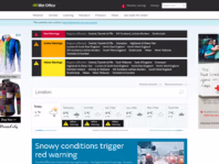
Met Office weather forecasts for the UK. World leading weather services for the public.

aarp.org

xmc.tw


dultmeier.com


www.uvaro.com


keystonetutors.com


lottie.org

perfectfitbackgroundchecks.com

founderscard.com

majordumpsters.com

funeralcelebrantacademy.co.uk